
Women danim jacket
$249.00

Red formal dress
$129.00

Man winter blazer
$149.00$99.00
Subtotal$477

 General
Blue is the most ordered uniform colour in India and the most frequently mismatched. A blue uniform saree looks straightforward on a quotation and then arrives a half tone away from the batch bought eighteen months ago, leaving a department in two visibly different shades. The problem is rarely the dyer. It is the absence of a controlled reference. This guide explains how blue behaves, why it drifts, and how institutions lock a blue uniform saree so it stays constant across years of reorders.
Human vision separates blue tones unusually well, which is why two greys can pass as the same colour while two blues a half tone apart look plainly different. That perceptual fact turns ordinary dye lot variation into a visible failure in a way that beige or maroon would absorb.
Dye chemistry adds to it. Many blues are built from combinations rather than a single dyestuff, and a small shift in the ratio moves the result towards green or purple rather than simply lighter or darker. A shift in hue is far more noticeable than a shift in depth.
Base cloth matters too. The same dye recipe on a slightly different cotton, or on a blend with more polyester, lands in a different place because the fibres take up dye at different rates. A supplier who changes base fabric quietly will produce a shade change even with an unchanged recipe.
None of this is exotic. It is normal textile behaviour, and it is entirely manageable once a buyer stops treating blue as a word and starts treating it as a physical standard. Understanding dyeing as a process makes the conversation with a supplier much more productive.
Navy is the institutional default for a uniform because it reads as formal, hides marks well and sits comfortably beside most brand palettes. It is a strong choice for administration, front desk and teaching roles where a settled, serious impression is wanted.
Mid blues and royal blues carry more energy and photograph well, which suits customer facing and event roles. They also show fading sooner than navy, because there is further to fall before the change becomes obvious. Where a mid blue is chosen, expect a shorter replacement cycle or specify a higher colour fastness grade.
Pale blues read as clean and are common in clinical and laboratory settings. They show soiling quickly and are the hardest blues to keep matched across batches, since small variation is most visible at low depth. Choose them deliberately, with a shorter replacement cycle budgeted rather than assumed away.
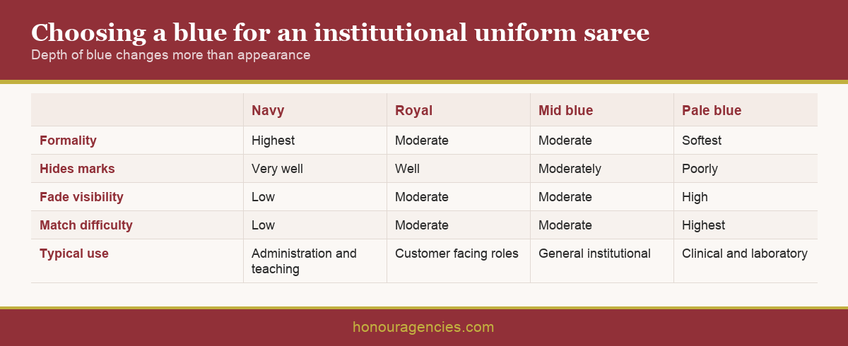
Consider how the blue sits against the blouse and any border. A navy saree with a black border reads almost as a single dark mass at a distance, while the same navy with a light border keeps its shape. Institutions often approve the body colour carefully and then let the border be chosen by whoever is making the garment, which undoes the work.
Where several departments wear blue, keep the chosen tones far enough apart to separate at a corridor glance. Two adjacent blues defeat the purpose of colour coding entirely. Our note on choosing a colour that works for your brand covers how to build a workable palette.
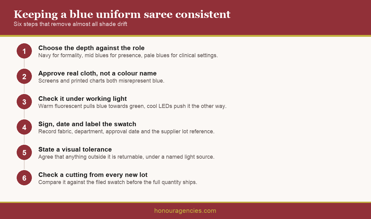
The single most useful thing an institution can do is approve cloth, not a description. Ask the supplier you buy from for a physical swatch of the actual production fabric, sign and date it, keep one copy and require the supplier to hold the matching piece against your account.
Record what the swatch belongs to. A reference is only useful if it names the fabric, the department, the approval date and the supplier's own lot identifier. A drawer full of unlabelled blue squares helps nobody two years later.
Set the tolerance explicitly. No two production runs are identical, and a sensible arrangement states that deliveries will be matched to the filed swatch and that anything outside an agreed visual tolerance is returnable. Suppliers respect a stated standard far more than a vague expectation.
Ask what happens when the shade cannot be repeated. Yarns and dyestuffs are discontinued, and a good supplier tells you and submits the closest match for approval rather than shipping something near enough. Get that undertaking in writing before the first order rather than after a disappointing delivery.
Blue is unusually sensitive to light source. Warm fluorescent and older tube lighting pull blues towards green, while cool white LEDs push them the other way. A navy approved at a shop counter near a window can look distinctly different in a windowless corridor.
Approve under working light. Take the swatches into the ward, the classroom, the lobby or the office where the uniform will be worn, and look at them there. This single step prevents most of the complaints that surface a month after delivery.
Laundry is the other ageing factor. Hot cycles and strong detergent strip blue faster than most shades, and the fade is uneven because the pleated and folded areas wash differently from flat panels. Publish the care specification to whoever controls the machines rather than only to staff.
Plan replacement by cohort rather than by individual garment. Blue fades gradually and uniformly within a batch, so replacing whole groups keeps a department looking consistent, while replacing individual sarees creates the patchwork the colour discipline was meant to avoid. Our guidance on caring for and maintaining institutional wear covers the day to day routine.
Order in a way that reduces the number of dye lots in circulation. Where budget allows, a larger first order covering current staff plus a reserve produces a single lot across the department, which is the cleanest possible starting point.
Ask the supplier how long they will hold your reference and what the minimum quantity is for a repeat run. Blue is widely stocked, so many suppliers can serve smaller repeats than they could in an unusual shade, but this should be confirmed rather than assumed.
Plan the timing around production seasons. Mills run hard before festival periods, and a repeat run placed into that window competes with much larger orders for dyeing capacity. Placing repeat orders in the quieter months usually buys both a better lead time and a more careful match.
Always request a cutting from the new lot before the full quantity ships. Comparing that cutting against the filed swatch takes minutes and catches a mismatch while it is still the supplier's problem rather than yours.
Keep the order history with the swatch. Dates, quantities, lot references and who approved each delivery turn a reorder into a short instruction. Institutions that manage large repeat orders well are usually just the ones keeping better records.
A blue uniform saree stays consistent when the shade is treated as a physical standard rather than a word. Choose the depth of blue against the role, approve real cloth under real working light, hold a signed and labelled swatch with the supplier holding its twin, state a tolerance, and check a cutting from every new lot. Those habits remove almost all shade drift. Honour Agencies has supplied wholesale and institutional sarees from Ernakulam for 35 years. To discuss a requirement, contact our team.
Q: Why do blue uniform sarees look different between orders? A: The eye separates blue tones easily, so ordinary dye lot variation reads as an obvious mismatch. Many blues are also mixed from several dyestuffs, and a small ratio shift moves the hue rather than just the depth.
Q: Which blue is best for institutional uniforms? A: Navy for most settings, because it reads as formal, hides marks and sits beside most brand palettes. Mid and royal blues suit customer facing roles but show fading sooner and need a shorter replacement cycle.
Q: Can a colour name be used to reorder a shade? A: No. Colour names, screen images and printed swatches will not hold a shade. Only a physical cloth reference, signed, dated and held by both you and the supplier, produces a repeatable match.
Q: Does lighting really change how blue looks? A: Considerably. Warm fluorescent light pulls blue towards green and cool LEDs push it the other way. Approve shades in the actual ward, classroom or lobby rather than at a shop counter.
Q: What tolerance should be agreed with a supplier? A: State that deliveries will be matched to the filed swatch and that anything outside an agreed visual tolerance is returnable. Suppliers respond far better to a stated standard than to an unspoken expectation.
Q: What if the exact blue cannot be repeated? A: Ask for that undertaking upfront. A reliable supplier tells you when a yarn or dyestuff is discontinued and submits the closest match for approval, rather than shipping something near enough without mentioning it.
Q: Why does blue fade unevenly? A: Pleated and folded areas wash differently from flat panels, so fading shows first at the folds. Hot cycles and strong detergent accelerate this, which is why the laundry needs the care specification directly.
Q: Should uniforms be replaced individually or in groups? A: In cohorts. Blue fades gradually and evenly within a batch, so replacing whole groups keeps a department consistent, while swapping individual sarees creates a patchwork of tones.
Q: How can we reduce the number of dye lots in circulation? A: Place a larger first order covering current staff plus a reserve, so the department starts on a single lot. Every subsequent lot introduces a small step, so fewer lots means better consistency.
Q: Should we check new stock before it ships? A: Always request a cutting from the new lot and compare it against your filed swatch. It takes minutes and catches a mismatch while it is still the supplier's problem. Our institutional supply chain guide covers the full process.


Or login with