
Women danim jacket
$249.00

Red formal dress
$129.00

Man winter blazer
$149.00$99.00
Subtotal$477

 General
Pink is chosen for its warmth. Schools use it to soften a formal uniform, clinics use it to feel approachable, and reception teams use it because it photographs well and reads as welcoming. It is also one of the harder colours to keep consistent, because pink fades visibly and shifts easily between orders. A pink uniform saree rewards careful specification more than almost any other shade. This guide covers how to choose the tone, control it, and reorder it without a department ending up in three different pinks.
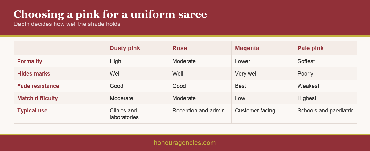
Pink covers a wide range, and the choice should follow the setting rather than a preference. Dusty and muted pinks read as calm and professional, which suits clinics, laboratories and administrative roles where the uniform should reassure rather than announce.
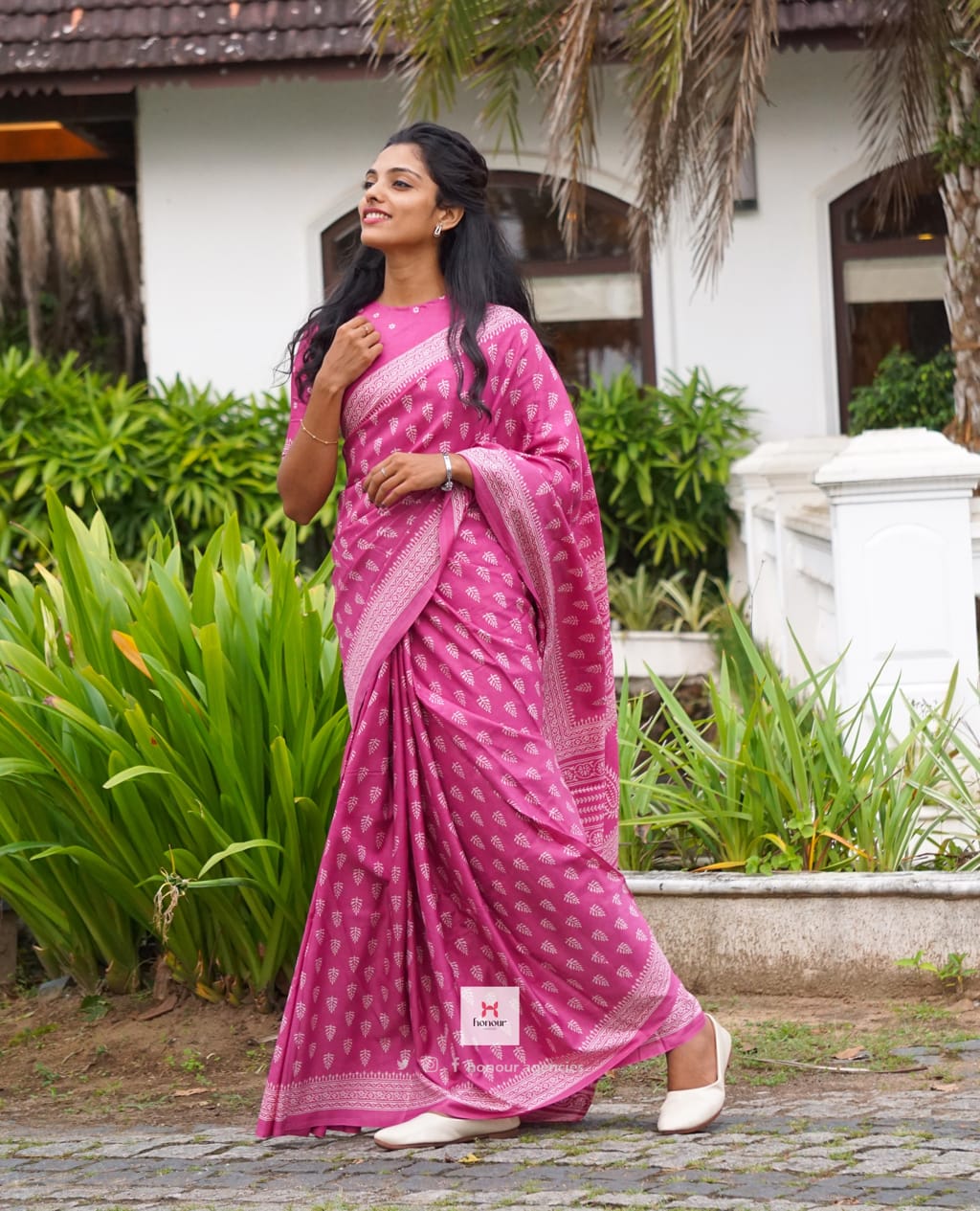
Deeper rose and magenta tones carry more presence and hold up better against fading, which makes them a practical choice for front desk and customer facing teams. They also sit more comfortably beside strong brand colours, since a pale pink next to a saturated logo tends to look washed out.
Pale and baby pinks are common in schools and paediatric settings because they feel gentle and unintimidating. They are the least forgiving option. They show every mark, they fade fastest, and small batch variation is most visible at low depth. Choosing one is entirely reasonable, provided the shorter replacement cycle is budgeted rather than discovered.
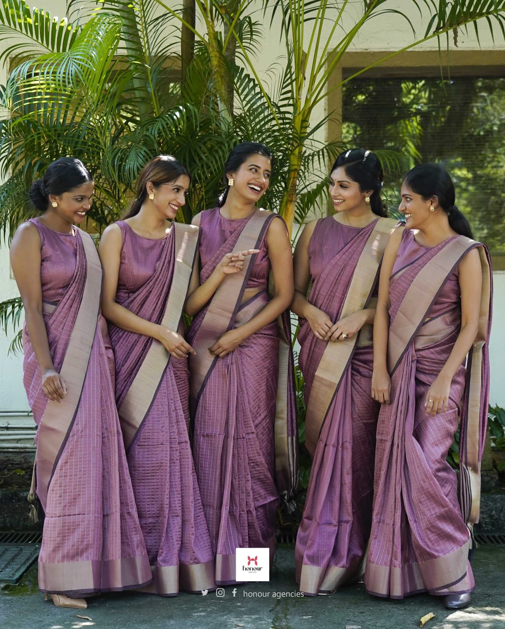
Pair the pink with a considered border and blouse. A pale pink saree with a dark border keeps its shape at a distance, while the same pink with a similar toned border can look shapeless across a room. Institutions often approve the body colour carefully and then leave the border to whoever makes the garment, which undoes the effort.
Our guide to choosing a colour that works for your brand covers how to place a shade inside a wider institutional palette.
Pink is usually built by diluting a red dyestuff, and dilution amplifies error. A small change in dye concentration that would be invisible in a deep red becomes a clear step in a pale pink, which is why light shades are the hardest to match across production runs.
Direction of drift matters as much as amount. Depending on the recipe, a variation can push pink towards peach, coral or lilac. The eye notices a change of hue far more readily than a change of depth, so a batch that is technically close can still look wrong beside the older stock.
Base cloth changes the result too. The same recipe on a different cotton, or on a blend with more polyester, lands in a different place because fibres absorb dye at different rates. A supplier who quietly changes base fabric will produce a shade change without changing the recipe at all.
None of this makes pink a bad choice. It makes pink a colour that needs a controlled reference. Once a physical standard exists, repeatability stops being a matter of luck. A working knowledge of colour fastness helps when comparing supplier claims about how a shade will hold.
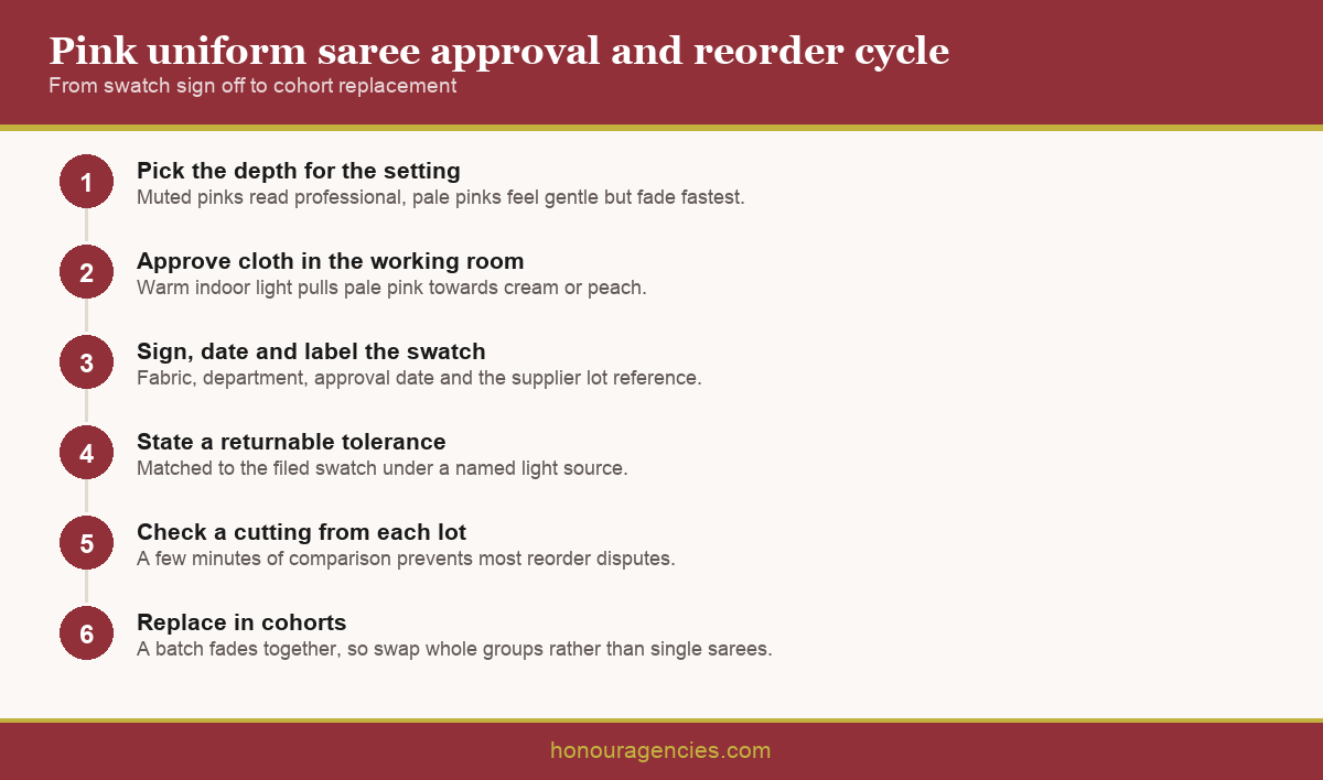
Approve cloth, never a description. Ask the supplier you buy from for a physical swatch cut from the actual production fabric, sign and date it, keep one copy on site and require the supplier to hold its twin against your account.
Label the reference properly. A swatch is only useful if it records the fabric, the department, the approval date and the supplier's own lot identifier. Unlabelled pink squares in a drawer are worthless eighteen months later when a reorder is being checked.
State the tolerance. No two runs are identical, so agree that deliveries will be matched against the filed swatch and that anything outside an agreed visual tolerance is returnable. A stated standard is treated far more seriously than an unspoken expectation.
Establish what happens when the shade cannot be repeated. Dyestuffs and yarns are discontinued, and a dependable supplier tells you and submits the nearest match for approval instead of shipping something close and saying nothing. Ask for that undertaking before the first order, not after a delivery that does not match.
Ask for a cutting from each new lot before the full quantity ships. Comparing it against the filed swatch takes a few minutes and catches a mismatch while it is still the supplier's problem. This one habit prevents most reorder disputes.
Pink is strongly affected by light source. Warm indoor lighting deepens and warms it, pulling pale pinks towards cream or peach, while cool daylight reveals the true tone. A shade approved beside a window can look noticeably different in a classroom or a windowless reception.
Approve in the room where the uniform will be worn. Take the swatches to the actual space, look at them under the lighting staff work in, and only then sign. This single step removes most of the complaints that appear a month after delivery.
Fading is the reality to plan around. Pink loses depth faster than navy or maroon under repeated hot washing, and it fades unevenly because pleats and folds wash differently from flat panels. Publish the care instruction to the laundry rather than only to staff, since most premature fading comes from a cycle nobody adjusted.
Replace in cohorts rather than one garment at a time. A pink batch fades together, so swapping whole groups keeps a department looking consistent, while replacing individual sarees puts a bright new pink beside three faded ones. Our guidance on caring for and maintaining institutional wear covers the routine that slows this down.
Reduce the number of dye lots in circulation. Where budget allows, cover current staff plus a reserve in the first order so the department begins on a single lot. Every additional lot introduces a small step, and pale pink shows steps most clearly.
Confirm the reorder minimum before approving the shade. A pink that only runs economically at large quantities is the wrong choice for a school that needs twelve sarees after an intake. Ask whether the supplier can hold stock or yarn against your account.
Time repeat orders away from peak production. Mills run hard before festival periods, and a repeat placed into that window competes for dyeing capacity with much larger orders. Quieter months usually deliver both a better lead time and a more careful match.
Think about storage as well as ordering. Reserve stock held in a damp store will mildew, and folded pieces left untouched for a year develop permanent lines along the folds that no amount of pressing removes. Keep spare sarees dry, off the floor and refolded periodically so the reserve is actually usable when an intake arrives.
Keep the order history filed with the swatch. Dates, quantities, lot references and approvals turn each reorder into a short instruction rather than a fresh negotiation. Institutions that handle large repeat orders smoothly are usually the ones keeping better records.
A pink uniform saree works beautifully when the shade is treated as a physical standard and the fade is planned for rather than resented. Choose the depth against the setting, approve real cloth under real working light, hold a signed and labelled swatch, check a cutting from every lot, and replace in cohorts. Honour Agencies has supplied wholesale and institutional sarees from Ernakulam for 35 years. To discuss a school or reception requirement, contact our team.
Q: Which pink works best for a school uniform saree? A: Dusty and muted pinks read as calm and professional and hide marks better than pale tones. Pale pinks feel gentle and suit younger settings, but they fade fastest and need a shorter replacement cycle.
Q: Why is pink harder to match than other colours? A: Pink is usually a diluted red, and dilution amplifies small errors. A variation that would be invisible in a deep shade becomes a clear step in a pale pink, and it can shift towards peach or lilac.
Q: Does pink fade faster than other uniform colours? A: Yes, noticeably faster than navy or maroon under repeated hot washing. It also fades unevenly, because pleats and folds wash differently from flat panels, so folds show the change first.
Q: How should a pink shade be approved? A: Against a physical swatch cut from the actual production fabric, signed, dated and labelled with the fabric, department and lot reference. The supplier should hold a matching piece against your account.
Q: Does lighting change how pink looks? A: Considerably. Warm indoor lighting deepens pink towards cream or peach while daylight reveals the true tone. Approve the shade in the classroom or reception where the uniform will actually be worn.
Q: Should uniforms be replaced individually or in groups? A: In cohorts. A pink batch fades together, so replacing whole groups keeps the department consistent. Swapping single sarees puts a bright new pink beside faded ones and looks worse than doing nothing.
Q: What tolerance should be agreed for shade matching? A: Agree in writing that deliveries are matched to the filed swatch and that anything outside a stated visual tolerance is returnable. Suppliers take a stated standard far more seriously than an assumption.
Q: Can pink uniform sarees be reordered in small quantities? A: Often, once an account and shade reference exist. Confirm the repeat minimum before approving the shade, because a pink that only runs economically in large volumes suits few schools.
Q: How can we reduce shade variation across a department? A: Order current staff plus a reserve in one lot at the start, then check a cutting from every subsequent lot against the filed swatch before the full quantity ships.
Q: Does the border colour matter? A: More than most buyers expect. A pale pink with a similar toned border looks shapeless across a room, while a defined border holds the outline. Our guide to choosing a design for your institution covers the pairing.



Or login with